Plotting
ASH includes some basic functions for conveniently plotting data: including reaction profiles, contourplots, broadened spectra etc. These are essentially wrapper-functions around Matplotlib functionality.
All the plotting functions documented here require a Matplotlib installation in the Python environment. Should be easily installed via either pip or Anaconda.
ASH_plot: Basic plotting
ASH_plot is a simple wrapper around the powerful Matplotlib library, just designed to make basic plotting of data (calculated by ASH) as straightforward as possible.
Note
If you need more advanced plotting options than provided here, it is probably best to use Matplotlib directly instead of ASH_plot. Let the developer know if you have suggestions for simple improvements to ASH_plot.
class ASH_plot():
  def __init__(self, figuretitle='Plottyplot', num_subplots=1, dpi=200, imageformat='png', figsize=(9,5),
      x_axislabel='X-axis', y_axislabel='Energy (X)', x_axislabels=None, y_axislabels=None, title='Plot-title',
      subplot_titles=None, xlimit=None, ylimit=None, backend='Agg',
      legend_pos=None, horizontal=False, tight_layout=True, padding=None):
  def addseries(self,subplot, surfacedictionary=None, x_list=None, y_list=None, x_labels=None, label='Series', color='blue', pointsize=40,
                  scatter=True, line=True, bar=False, scatter_linewidth=2, line_linewidth=1, barwidth=None, barcolors=None,
                  marker='o', legend=True, x_scaling=1.0,y_scaling=1.0,xticklabelrotation=80, x_scale_log=False, y_scale_log=False, colormap='viridis'):
  def invert_x_axis(self,subplot):
  def invert_y_axis(self,subplot):
  def savefig(self, filename, imageformat=None, dpi=None):
  def showplot(self):
ASH_plot options:
Keyword |
Type |
Default value |
Details |
|---|---|---|---|
|
string |
'Plottyplot' |
Title of the figure. |
|
integer |
1 |
Number of subplots. |
|
integer |
200 |
Resolution of the final figure (dots per inch). |
|
string |
'png' |
Imageformat. Options: 'png', 'pdf', 'jpg', '.tiff, 'svg' etc. |
|
tuple of integers |
(9,5) |
Figure size dimensions. |
|
string |
'X-axis' |
x-axis label of plot (when num_subplots=1). |
|
string |
'Energy(X)' |
y- axis label of plot (when num_subplots=1). |
|
list of strings |
None |
x-axes labels of each subplot (when num_subplots>1) |
|
list of strings |
None |
y-axes labels of each subplot (when num_subplots>1) |
|
string |
Plot-title |
Title of plot (when num_subplots=1) |
|
list of strings |
None |
Titles for each subplot. |
|
Boolean |
False |
Invert x-axis or not |
|
Boolean |
False |
Invert y-axis or not |
|
list of floats |
None |
x-axis limit |
|
list of floats |
None |
y-axis limit |
|
list of floats |
None |
Position of legend on plot |
ASH_plot.add_series options:
Keyword |
Type |
Default value |
Details |
|---|---|---|---|
|
integer |
None |
What subplot to add data-series to. Use 0 for first subplot. |
|
list |
None |
List of x-values for series. |
|
list |
None |
List of y-values for series. |
|
dict |
None |
Alternative to x_list/y_list. Dictionary should have x-values as keys and y-values as values. |
|
string |
'Series' |
Label of series added. Will show up in legend. |
|
string |
'blue' |
What color to use for series. Matplotlib colors |
|
list |
None |
List of colors to use for each bar. Matplotlib colors |
|
integer |
40 |
Marker-size in scatterplots. |
|
Boolean |
True |
Do scatterplot or not. |
|
Boolean |
True |
Do lineplot or not. |
|
Boolean |
False |
Do barplot or not. Incompatible with line and scatter above. |
|
integer |
2 |
Linewidth of scatter-marker edges. |
|
integer |
1 |
Linewidth of lines in line-plots. |
|
integer |
None |
Width of bar columns. Default is None, ie. width is automatically adapted to data. |
|
string |
'o' |
What marker symbol to use in scatterplots. Matplotlib markers |
|
Boolean |
True |
Whether to plot legend or not. |
|
string |
'viridis' |
Optional colormap to use. Currently only used for barplots (if barcolors=None) |
To use, you just need to create an ASH_plot object, add one or more dataseries to the object (using the .addseries method) and then save (using the .savefig method). Since the data is provided via simply Python lists you could of course run an ASH job that first generates the data from e.g. QM or QM/MM calculations and then plot the data at the end, all in the same script.
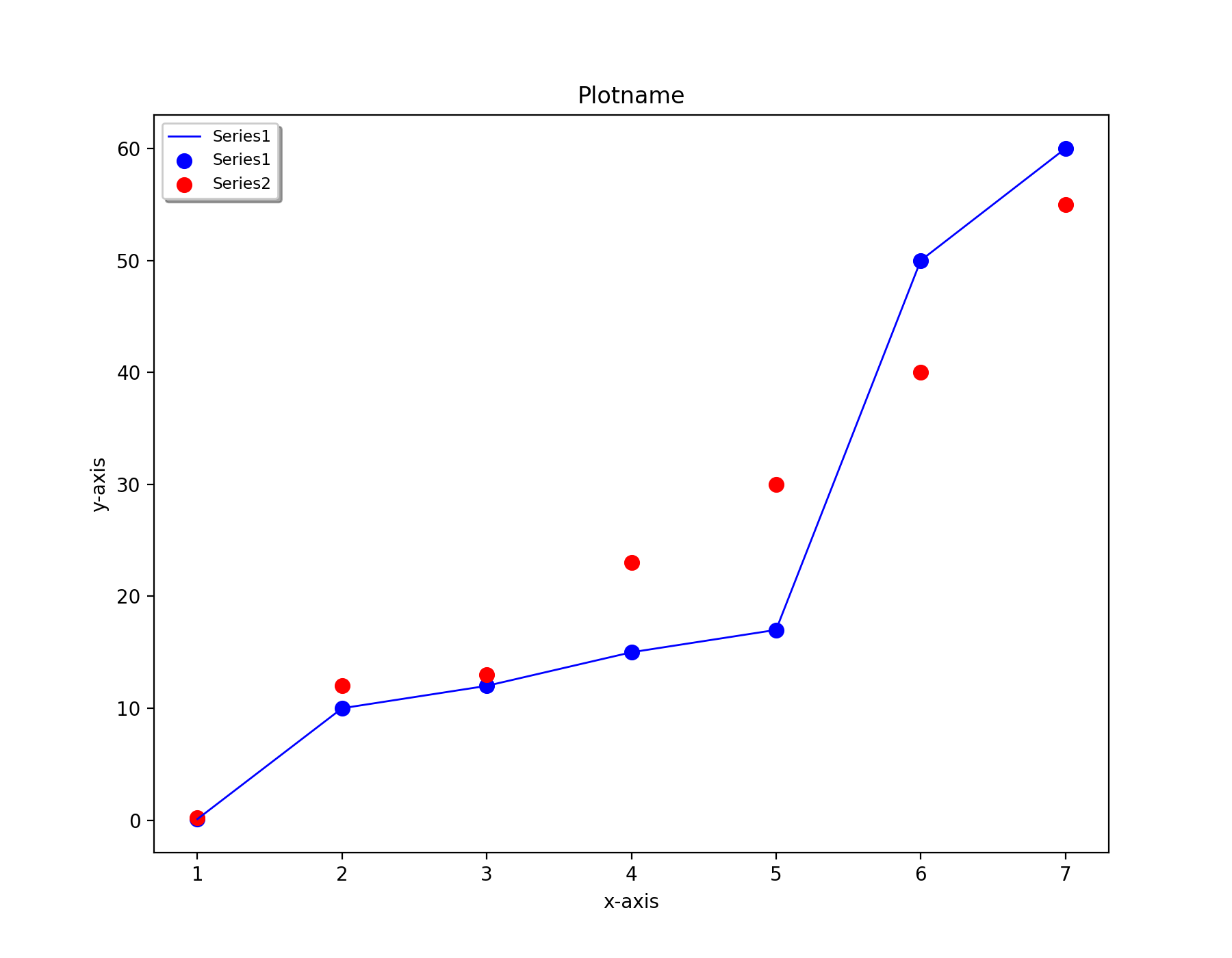
Basic 1-subplot example:
from ash import *

#Dataseries1. Data are simply Python lists
xvalues1=[1,2,3,4,5,6,7]
yvalues1=[0.1, 10.0, 12.0, 15.0, 17.0, 50.0, 60.0]
#Dataseries2
xvalues2=[1,2,3,4,5,6,7]
yvalues2=[0.2, 12.0, 13.0, 23.0, 30.0, 40.0, 55.0]

#Create ASH_plot object named edplot
eplot = ASH_plot("Plotname", num_subplots=1, x_axislabel="x-axis", y_axislabel='y-axis')

#Add a dataseries to subplot 0 (the only subplot)
eplot.addseries(0, x_list=xvalues1, y_list=yvalues1, label='Series1', color='blue', line=True, scatter=True)
eplot.addseries(0, x_list=xvalues2, y_list=yvalues2, label='Series2', color='red', line=False, scatter=True)

#Save figure
eplot.savefig('Simpleplot')
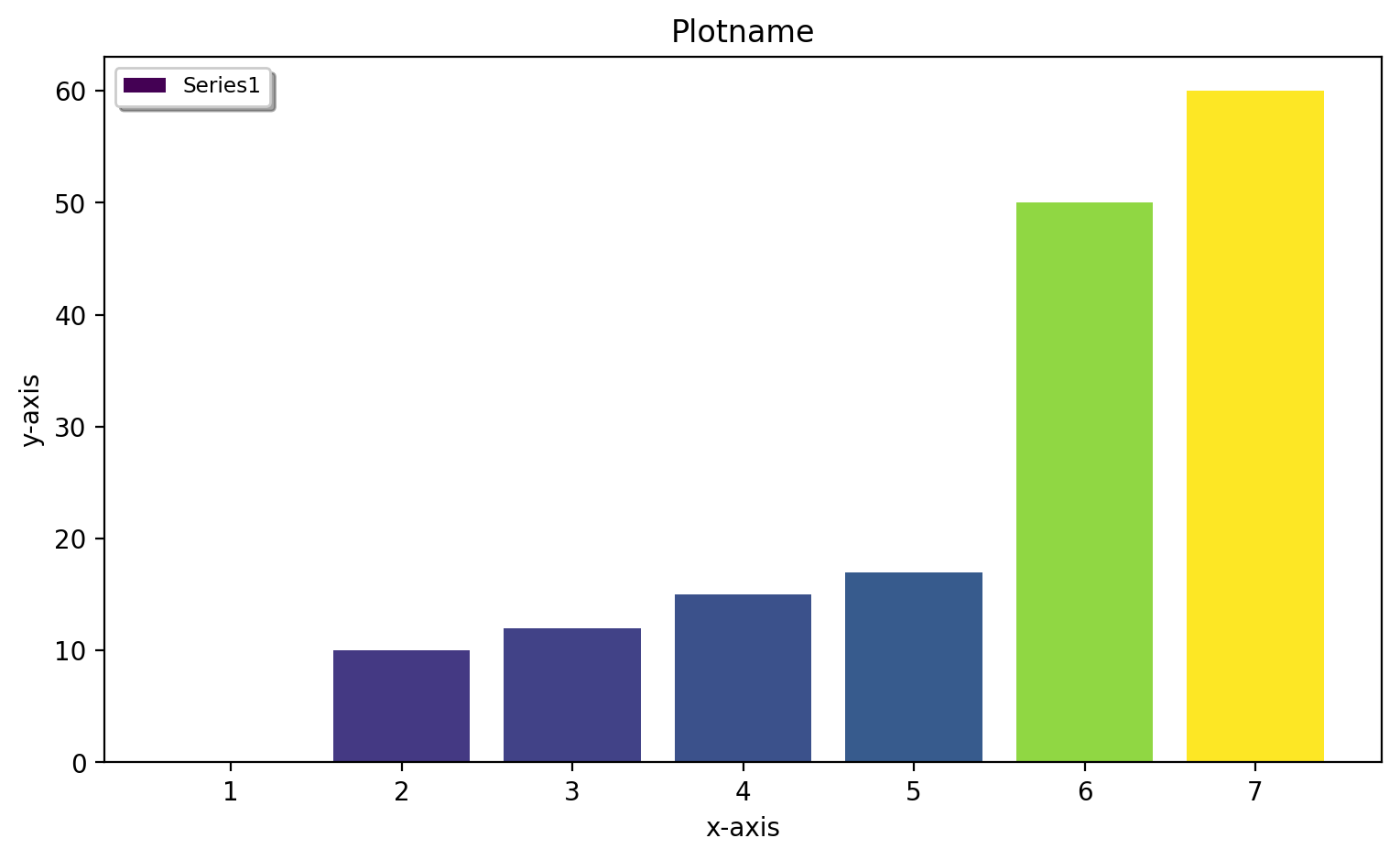
Barplot 1-subplot example:
Barplots are sometimes more suitable. Use bar=True in this case and turn off lines and scatter by: line=False and scatter=False. To control the colors of the barplot you can use the barcolors keyword. This should be a list of colors, one for each bar. By default (if no barcolors list provided), a colormap is used to generate colors for the datapoints, here taken from the default colormap 'viridis'. You can change the colormap via the colormap keyword (some options: 'viridis', 'inferno', 'inferno_r', 'plasma', 'magma')
from ash import *

#Dataseries1. Data are simply Python lists
xvalues1=[1,2,3,4,5,6,7]
yvalues1=[0.1, 10.0, 12.0, 15.0, 17.0, 50.0, 60.0]
#Dataseries2
xvalues2=[1,2,3,4,5,6,7]
yvalues2=[0.2, 12.0, 13.0, 23.0, 30.0, 40.0, 55.0]

#Create ASH_plot object named edplot
eplot = ASH_plot("Plotname", num_subplots=1, x_axislabel="x-axis", y_axislabel='y-axis')

#Add a dataseries to subplot 0 (the only subplot)
eplot.addseries(0, x_list=xvalues1, y_list=yvalues1, label='Series1', color='blue', bar=True, scatter=False, line=False)

#Save figure
eplot.savefig('Barplot')
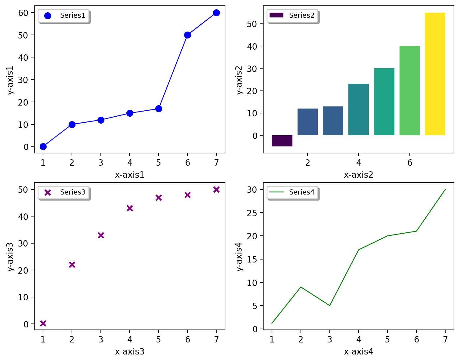
You can also create a figure with multiple subplots. Currently, num_subplots=1, 2, 3 or 4 works.
Basic 4-subplot example:
from ash import *

#Series1
xvalues1=[1,2,3,4,5,6,7]
yvalues1=[0.1, 10.0, 12.0, 15.0, 17.0, 50.0, 60.0]
#Series2
xvalues2=[1,2,3,4,5,6,7]
yvalues2=[-5, 12.0, 13.0, 23.0, 30.0, 40.0, 55.0]
#Series3
xvalues3=[1,2,3,4,5,6,7]
yvalues3=[0.25, 22.0, 33.0, 43.0, 47.0, 48.0, 50.0]
#Series4
xvalues4=[1,2,3,4,5,6,7]
yvalues4=[1.2, 9.0, 5.0, 17.0, 20.0, 21.0, 30.0]

#Create ASH_plot object named edplot
eplot = ASH_plot("Plotname", num_subplots=4, x_axislabels=["x-axis1", "x-axis2","x-axis3","x-axis4"],
        y_axislabels=["y-axis1", "y-axis2","y-axis3","y-axis4"], figsize=(9,7))

#Add a series to each subplot (0, 1, 2 or 3)
eplot.addseries(0, x_list=xvalues1, y_list=yvalues1, label='Series1', color='blue', line=True, scatter=True)
eplot.addseries(1, x_list=xvalues2, y_list=yvalues2, label='Series2', bar=True, line=False, scatter=False)
eplot.addseries(2, x_list=xvalues3, y_list=yvalues3, label='Series3', color='purple', line=False, scatter=True, marker='x')
eplot.addseries(3, x_list=xvalues4, y_list=yvalues4, label='Series4', color='green', line=True, scatter=False)

#Save figure
eplot.savefig('Simple-subplot4')
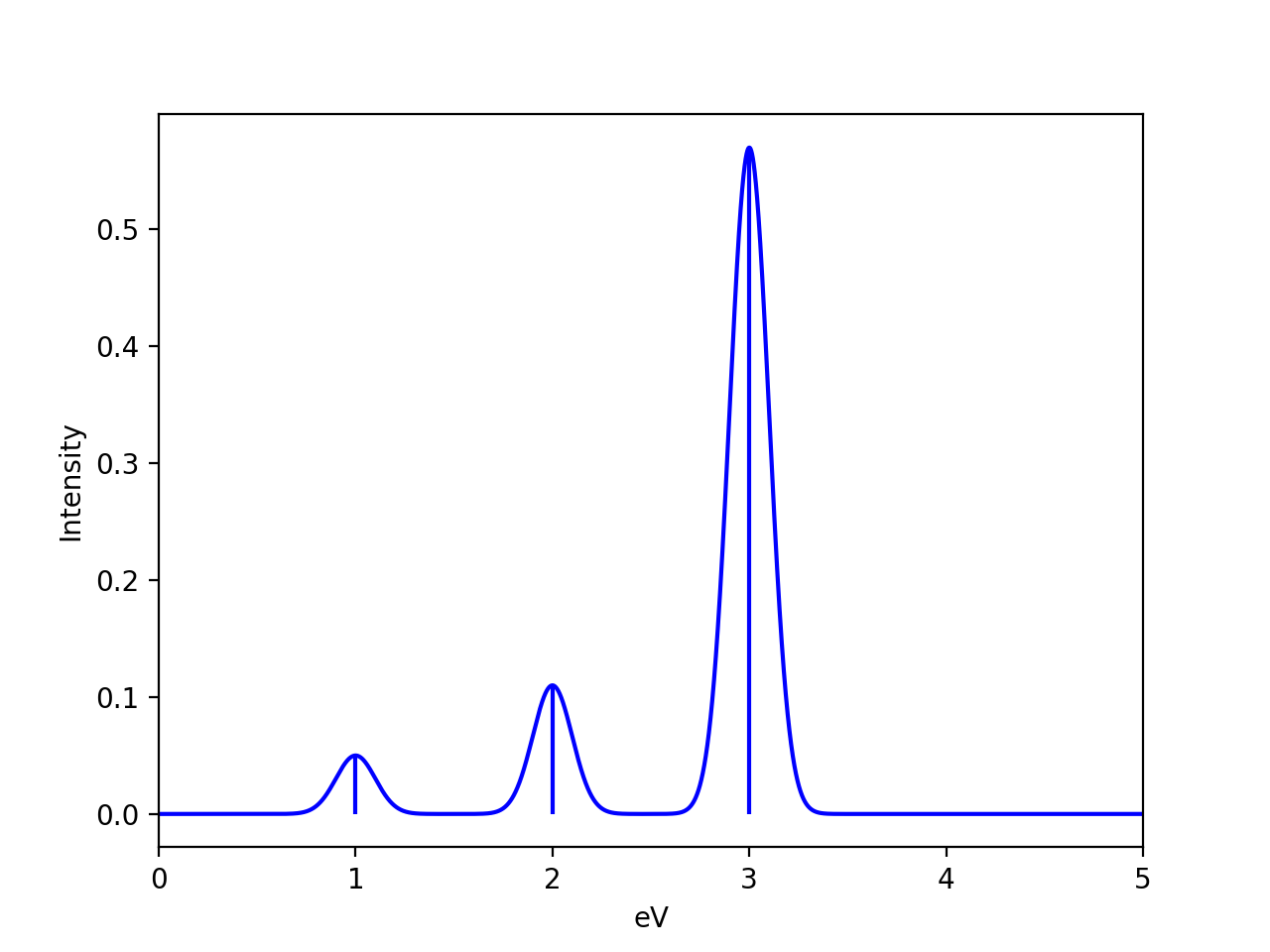
plot_Spectrum: Plotting broadened spectrum
The plot_Spectrum function takes a list of x-axis values (xvalues keyword), y-axis values (yvalues keyword), broadens each transition (stick) to create a broadened spectrum (written to a .dat file). The xvalues list is traditionally a Python list of energies (e.g. transition energies, Ionization-energies) and yvalues list is typically a list of intensities. Typically these quantities come from a current or previous ASH job. A Gaussian lineshape is used by default, Lorentz and Voight lineshapes are also possible.
def plot_Spectrum(xvalues=None, yvalues=None, plotname='Spectrum', range=None, unit='eV', broadening=0.1, points=10000,
    imageformat='png', dpi=200, matplotlib=True, CSV=True, color='blue', plot_sticks=True, lineshape='Gaussian', voigt_broadening=None):
The output is a broadened data-file (e.g. Spectrum.dat), a stick-spectrum file (e.g. Spectrum.stk) and an image file (e.g Spectrum.png), the latter requires Matplotlib.
Options:
plotname : String (name, used to name the output files)
range : List (x-axis range to plot; first value is start, second value is end)
unit : String (unit of x-axis used to label axis, default: eV)
lineshape : The lineshape function to use (Gaussian, Lorentz, Voigt). Default: Gaussian
broadening : number (the broadening factor in same unit as data, default: 0.1)
voight_broadening : list (list of 2 values to control sigma and gamma of Gaussian and Lorentz part of Voigt).
points : integer (number of points in broadened spectrum, default:10000)
imageformat : string-option (Matplotlib image format, e.g. png, svg; default: png)
dpi : integer (resolution of image, default:200)
matplotlib : Boolean(True/False) (whether to create image-file using Matplotlib or not, default: True)
CSV : Boolean(True/False) (whether to comma-separate values or not in dat and stk files, default: True)
plot_sticks : Boolean(True/False) (whether to plot sticks in plot or not default: True)
#Dummy example
transition_energies=[1.0, 2.0, 3.0]
transition_intensities=[0.05, 0.11, 0.57]

plot_Spectrum(xvalues=transition_energies, yvalues=transition_intensities, plotname='spectrum', range=[7,20], unit='eV',
    broadening=0.1, points=10000, imageformat='png', dpi=200)
The .dat and .stk files are CSV files that can be easily read into a numpy array like this:
import numpy as np

with open('Spectrum.dat') as csvfile:
    dataseries = np.genfromtxt(csvfile, delimiter=',')
print("dataseries", dataseries)
and can then be plotted separately.
MOplot_vertical: Plot vertical MO diagram
Input: Dictionary containing lists of molecular-orbital energies.
Created by MolecularOrbitalgrab in ORCA interface
Example: mos_dict= {"occ_alpha":[-1.0,-2.0,-3.0], "occ_beta":[-1.0,-2.0,-3.0], "unocc_alpha":[1.0,2.0,3.0], "unocc_beta":[1.0,2.0,3.0], "Openshell":True}
def MOplot_vertical(mos_dict, pointsize=4000, linewidth=2, label="Label", yrange=[-30,3], imageformat='png')
Example plotting MO diagrams for multiple ORCA outputfiles:
from ash import *
from ash.interfaces.interface_ORCA import MolecularOrbitalGrab
import glob

for file in glob.glob("*.out"):
    label=file.split(".")[0]
    orbdict = MolecularOrbitalGrab(file)
    MOplot_vertical(orbdict, pointsize=4000, linewidth=2, label=label, yrange=[-30,3], imageformat='png')
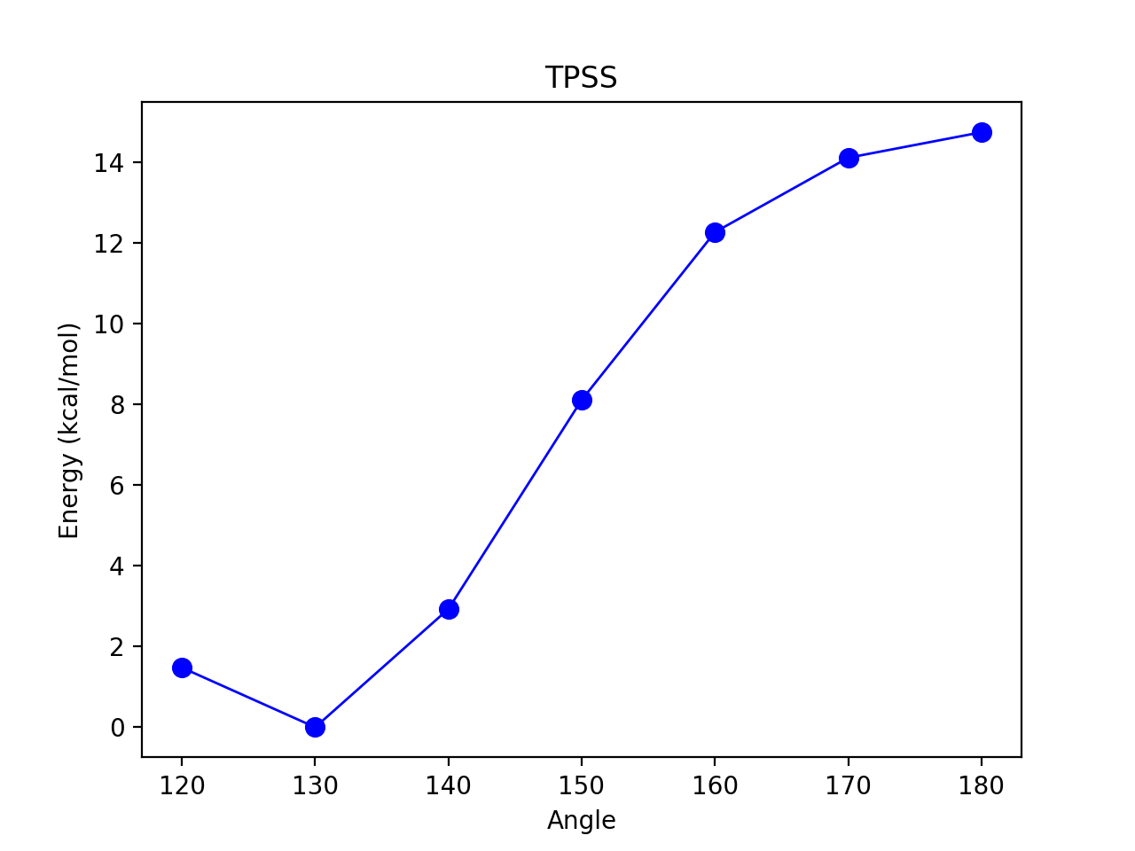
Reaction_profile
For a 1D scan (see Surface Scan), the result dictionary can be given to the reactionprofile_plot function which will visualize the relative energy surface as a lineplot. Dictionary should contain key-value pairs: coordinate : energy (in Eh). The output is an imagefile (PNG by default).
def reactionprofile_plot(surfacedictionary, finalunit='',label='Label', x_axislabel='Coord', y_axislabel='Energy', dpi=200, mode='pyplot',
                        imageformat='png', RelativeEnergy=True, pointsize=40, scatter_linewidth=2, line_linewidth=1, color='blue',
                        filename='Plot'):
By default, the RelativeEnergy =True keyword option is on but can be turned off. This assumes energies are initially in Eh (Hartree) and they will be converted into the desired unit.
The desired relative-energy unit is chosen via the finalunit keyword (valid options are: 'kcal/mol', 'kJ/mol', 'eV', 'cm-1').
The x-axis label or y-axis label of the plot can be changed via: x_axislabel ='String' or y_axislabel ='String'.
The label keyword is used to named the file saved: e.g.: PlotXX.png
The imageformat and dpi keywords can be used to specify the image format: default is PNG and 200.
pointsize, scatter_linewidth, line_linewidth and color keywords can be used to modify the plot.
import ash
#Simple with default options
reactionprofile_plot(surfacedictionary, finalunit='kcal/mol',label='TPSS', x_axislabel='Angle', y_axislabel='Energy')
#Specifying options

reactionprofile_plot(surfacedictionary, finalunit='kcal/mol',label='TPSS', x_axislabel='Angle', y_axislabel='Energy',
    imageformat='png', RelativeEnergy=True, pointsize=40, scatter_linewidth=2, line_linewidth=1, color='blue')
Contour_plot
For a 2D scan (see Surface Scan), the dictionary can be given to the contourplot function which will visualize the energy surface as a contourplot. The output is an imagefile (PNG by default).
The unit of the surface can be chosen via finalunit keyword (kcal/mol, kJ/mol, eV etc.).
A relative energy surface is by default calculated (RelativeEnergy=True) but this can be turned off (RelativeEnergy=False) e.g. for plotting a non-energetic surface.
Datapoint interpolation can be performed (currently only 'Cubic' option; the cubic power can be modified via interpolparameter). This requires a scipy installation.
The axes labels of the plot can be changed via: x_axislabel and y_axislabel.
The label keyword is used to named the file saved: e.g.: SurfaceXX.png
The imageformat and dpi keywords can be used to specify the image format: default is PNG and 200. See Matplotlib documentation for other imageformat options.
The default colormap is 'inferno_r'. Other colormaps are e.g. 'viridis', 'inferno', 'plasma', 'magma' (matplotlib keywords).
The number of contourlines used both for the filled contoursurface is by default 500 (numcontourlines=500). This value can be changed.
Alternatively only a few selected contour-lines can be shown by providing a list as argument to contour_values keyword. e.g. contour_values=[0.1,1.0,2.0.5.0]
Contourlines can be labelled or not: clinelabels=True/False
The filled surface can be made more opaque or more transparent via the contour_alpha keyword (default 0.75).
The color of the contour lines can be changed (contourline_color=black by default)
contourplot(surfacedictionary, finalunit='kcal/mol',label=method, interpolation='Cubic', x_axislabel='Bond (Å)', y_axislabel='Angle (°)')
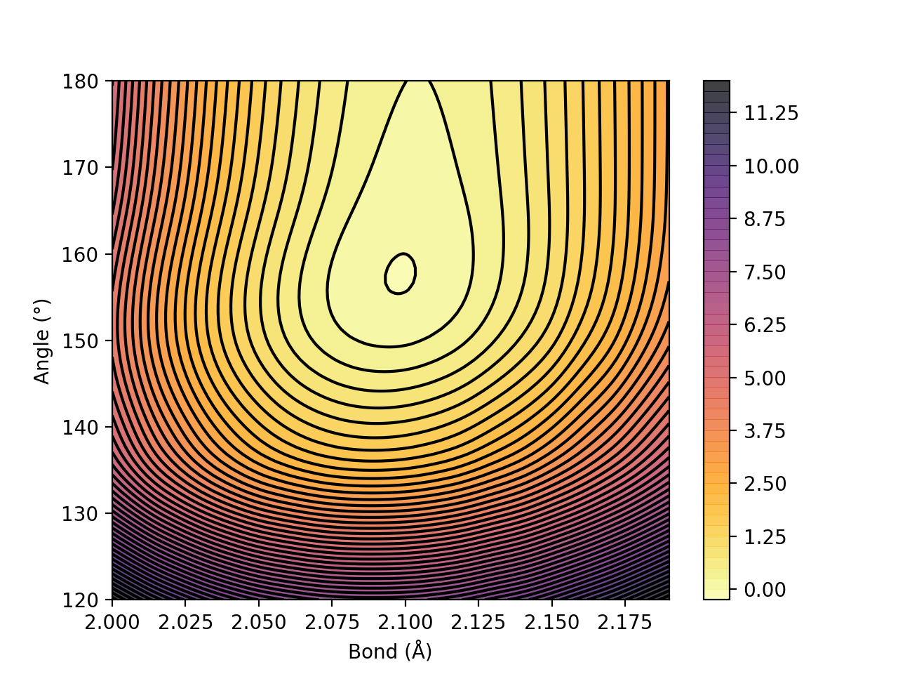
Figure. Energy surface of FeS2 scanning both the Fe-S bond and the S-Fe-S angle. The Fe-S bond coordinate applies to both Fe-S bonds.
Volume plots
If you have 3-dimensional data (i.e. 3 geometric coordinates and a value such as energy) then visualization is trickier but can still be done. A 3D relaxed surface scan (scanning 3 variables) can nowadays be performed in ASH (see Surface Scan). There are various ways of plotting such data, see e.g.:
In ASH we have added a convenient function to directly plot the results from a surface scan as a Plotly 3D Volume plot using the volumeplot function. This requires the plotly library to be installed (e.g. pip install plotly). One then simply provides the surface-dictionary of a 3D scan to volumeplot, adjusts label and relative energy scale as needed. Plotly will automatically open an interactive version of the plot in a browser (temporary) and also save a static image-file (PNG) and an interactive HTML-file.
from ash import *

surfacedictionary=read_surfacedict_from_file("surface_results.txt")
volumeplot(surfacedictionary, x_axislabel='Bond length (Å)', y_axislabel='Angle (°)',
              z_axislabel='Dihedral (°)', colorbar_label='Energy',
              finalunit='kcal/mol', RelativeEnergy=True,
              colorscale='RdBu_r', opacity=0.1, surface_count=20,
              )
Useful plotting variables:
colorscale : Choose e.g. between 'RdBu' (Red-to-Blue) or 'RdBu_r' (Red-to-Blue reversed). See Plotly colorscales
opacity: Max opacity
surface_count: Should be a large number for good rendering.
An interactive Plotly 3D volumeplot of a 3D-surface scan of ethanol is shown below: